15th January 2021
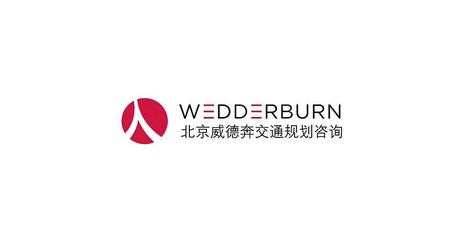
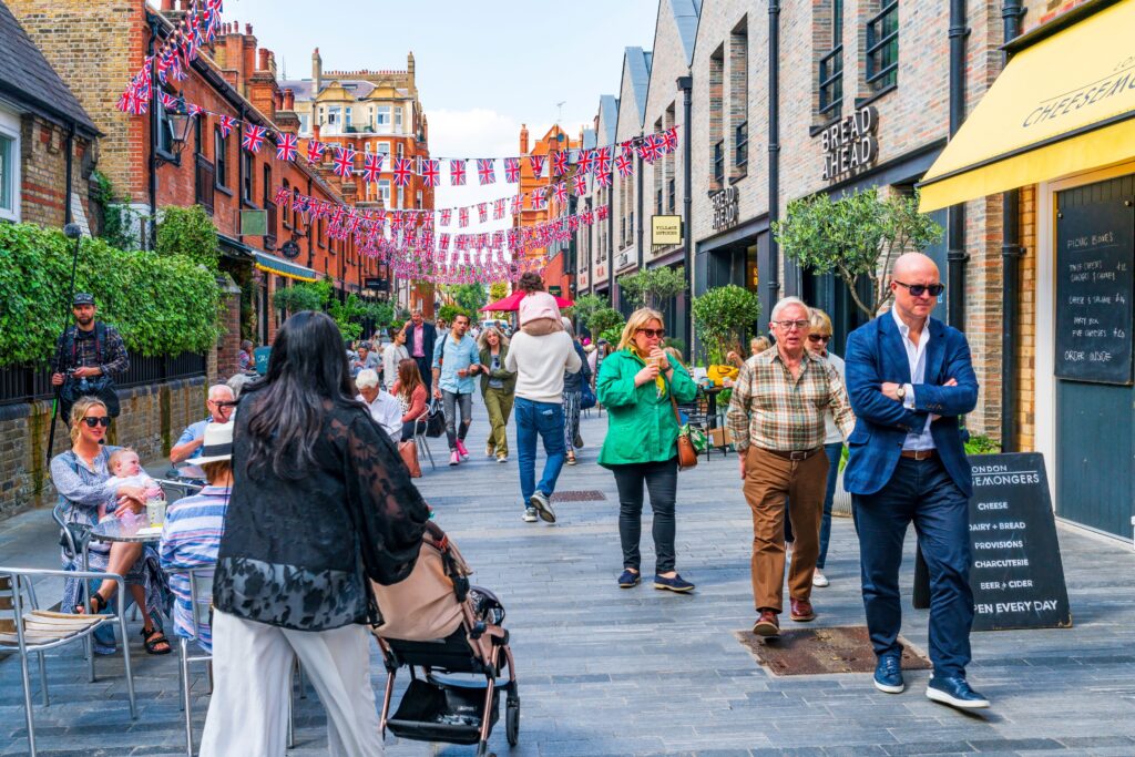
We are proud to present our new Chinese corporate logo. Our distinctive walking legs logo has morphed into the ‘Ren’ character. This simple two-stroke character means ‘person’ and thus fully embodies our philosophy of ‘transport planning at a human scale’. We are already applying this philosophy to several high profile retail and mixed use masterplans in major Chinese cities.
Through our cooperation with the Oval Partnership, we are able to offer our transport planning services throughout China branded as Beijing Wedderburn Transport Planning Consulting.
Please contact [email protected] for more information.
我们很高兴跟大家分享我们公司中国区的新标志。之前的‘行人’标志变形为‘人’字,新标志的设计意义在于人字跟我们的以人为本的交通设计理念完全符合。而且,这个理念已经在中国很多商业和混合用地开发项目开始设施了。
通过我们跟欧华尔顾问有限公司的合作,我们以北京威德奔交通规划咨询的名称开始提供了交通咨询服务。
如果想咨询更多可以联系 :
北京办公室联系人 – 楚杰士 (Georgies) [email protected]
